Part 1 here.Part 2 here.Part 3 here.Part 4 here.This is the last of my process posts so I'll be bringing it a close by showing how I add depth to the characters with "shading."
As I've said in my other posts, there's not too much of a trick here, just drawing shapes and having a good eye for visualizing the characters in 3D space. You need to be able to predict where light will hit their bodies and where it won't. I find that I don't have to be super realistic with this or anything, I just have to do it in a way that makes sense, and from there I can have fun with it and try to come up with interesting shapes.
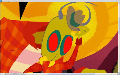
So how exactly did I make this:
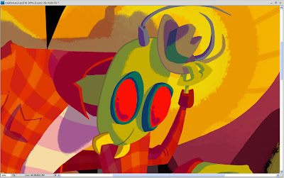
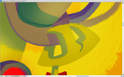
Into this?
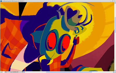
I started out by creating a new layer and making it around 40 to 50% transparent. Then I picked a dark color, usually a dark red or purple, and colored in the areas that I wanted to be darker. I typically use a custom brush I've made that has a bit of a chalk look to it. I really like the look of this brush and I use it on most my of work.
The dark color, when placed semi-transparently over the base color, just naturally creates a darker version of the colors beneath it. If it doesn't look quite right on a certain color then I'll go back and change it. For example, in the image above you can see how the shadow on the Mothman's T-shirt is more purple, where the shading on his skin is more turquoise.
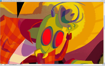
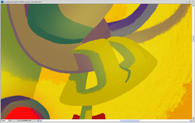
This is the exact same shading featured in the previous image, but here I've turned the opacity back up to 100% so that you can see what the layer looks like when it has no transparency. I don't always do my shading this way; sometimes I just pick each individual darker color with no transparency added to the layer, but doing it like this is much easier on more complicated drawings, especially for things like the flannel shirt. With this method I don't have to darken each of the flannel checks individually.
Here is a subtle effect I added where I made it look like his eyes are glowing red. I made two red shapes on a new layer and then blurred them to create a glowing look.

On another new layer, I drew reflections on his eyes and some stubble on his face. I like these reflections because they are meant to be in the shape of the light bulb he's chasing, but adding the filament lines created little hearts, which also made the reflections look sort of like skulls.
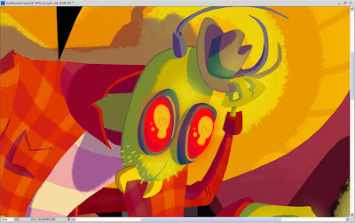
Next, I added a new layer where I essentially did the same glow effect I used on his eyes, only this time I made it look like the light is illuminating his face, hand, and hat with a yellow color. I used this sparingly on all the parts of the characters that were closest to the light source, and the parts I wanted to emphasize.
This is a before and after of what I call my "cleanup layer." Most of the time I make my shapes quickly rather than carefully so that I can get a feel for where the drawing is going. So for more complicated drawings I put a new layer above all the others and use it to tidy up all my edges and things.
After all of that, I ended up with something like this:
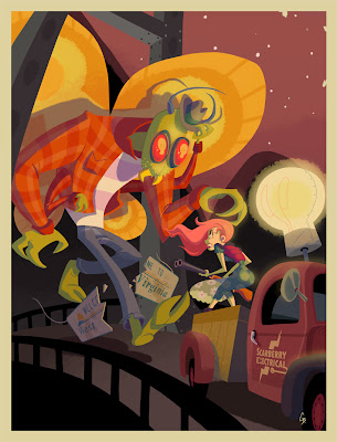
And finally, I added some text to complete the movie poster feel...
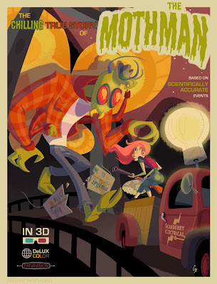
...and I got the final image! I looked at a lot of old horror movie posters to come up with ideas for the types of logos and text I should add. I love what I call the more "classic" logo elements, like rainbow colors, globes, etc. I went to a free font site to find a good font for the movie title, and I warped the text with Photoshop to give it a more dynamic feel.
So there you have it, all my dirty little art secrets. It seems kind of weird to give out all this advice because I am entirely self taught in Photoshop, and most of the time I assume that I'm doing all this stuff in a backwards or overly complicated way.
I sincerely thank anybody who read of all these, and I encourage you to check out the past posts if you're interested and missed any. You can find the links at the top of this post.
After all is said and done, I'm very happy with this piece and I think it's on its way to becoming one of my favorites. I love that we have such a prominent folklore monster like the Mothman here in my home state of WV, and I encourage you to read
more about him here. We also have the Flatwoods Monster, but that's for a future piece!


